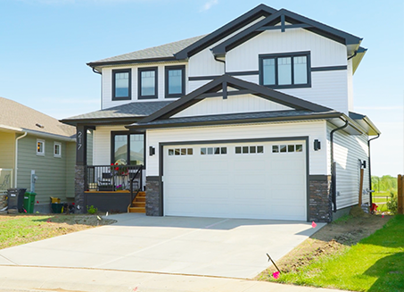
The stunning shots of the beautiful homes with expert craftsmanship grabs your attention, but it’s the laidback and approachable interview with the owner that invites you to reach out to get to know more about Aquilla Homes.
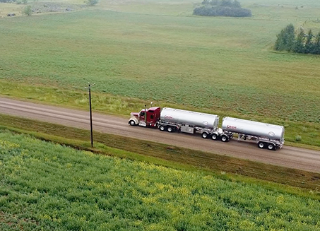
We worked very closely with the in-house marketing team at DMM Energy to create this stunning showcase video for their website and marketing campaign. It was a complicated shoot at multiple locations in northern Saskatchewan, coordinating with multiple stakeholders,...
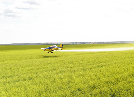
It’s not often that we get to incorporate a flight schedule into one of our shoot schedules, and you can’t go wrong with stunning early-morning ariels at sunrise! For Kindersley Air Spray we incorporated elements from their radio campaign into the scripting and...
Few people know about Manitoba’s own Hemp Production Services, despite it being the largest Canadian-owned wholesale supplier and one of the largest exporters of hemp food products in the world. HPS was eager for us to tell their story and help them build brand...
New mompreneurs Lea and Cassia are west coast sisters who came to us with the goal of creating a platform to easily plan and organize kids’ schedules. We worked closely beside the KIDGYSTICS team and offered them our expertise in establishing their place within...