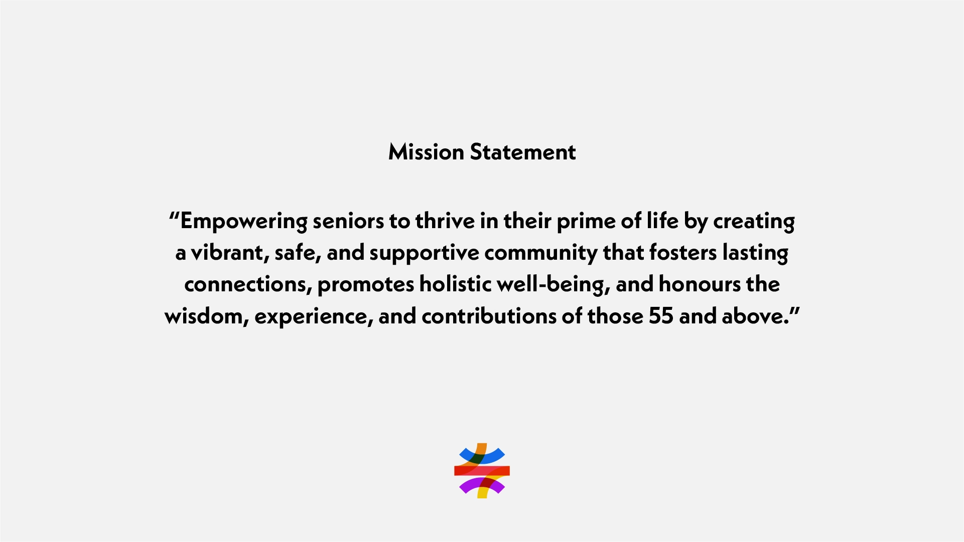
55 North Community Centre empowers adults 55+ to thrive in the prime of life in a vibrant, safe, and supportive community. As part of their recent growth as an organization, we helped them re-evaluate their identity and develop a new branding solution.
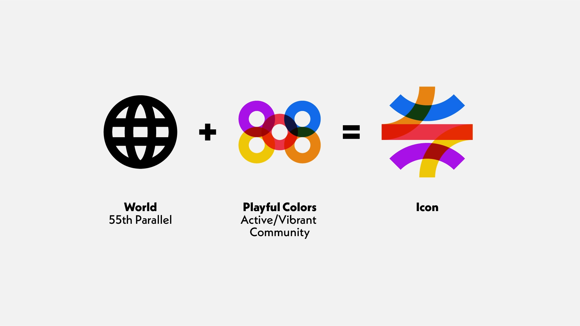
The logo solution we created together redefines what a community centre looks like and breaks through the Golden Age perception put upon the 55+ age group. The icon is inspired by 55 North Community Centre’s geographical ties in the name (55th parallel). A minimal interpretation of a world icon was manipulated to be more playful and symbolize community connection.